BBQ Lab (v1.3) - Dashboard
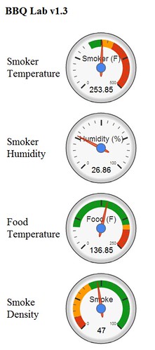
While BBQ Lab captures all sorts of good data – its equally important to make that data into useful information that can easily be used. While BBQ Lab has always used Google Charts for visual graphs and trending, BBQ Lab v1.3 included quite a few new visualizations including the new “gauge” view that has a round gauge for each metric – smoker temperature, smoker humidity, food temperature, and smoke density. Each gauge contains a min and max value and is color coded for ideal (green), ok (yellow), and bad (red) ranges, which allow for easy viewing.
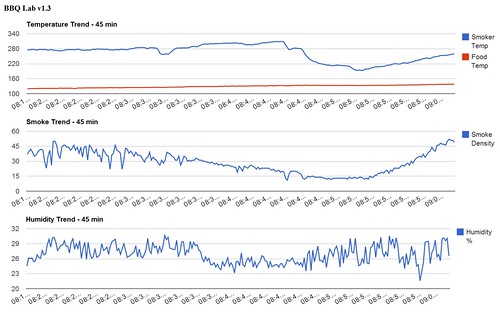
BBQ Lab v1.3 also includes “over time trends” to show trends in the metrics over time. This can be useful to identify trends and take action. Ex. smoke density is decreasing – add wood.
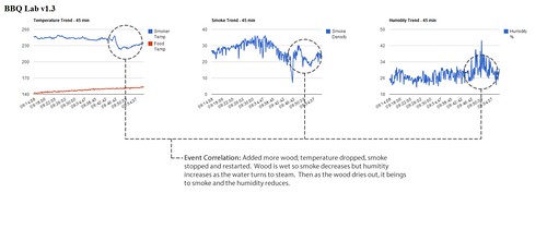
The data can also be correlated together to provide meaningful information about “events”. In this event, more wood was added to the smoker. The act of opening the smoker to add wood decreased the temperature by allowing hot air our and cool air in. The wood is also soaked in water to prolong its smoking; however, this initially reduces the smoke output until some of the water evaporates, which also temporarily increased the humidity. Therefore, this series of data could be correlated together programmatically to identify a “wood added” event.
-Adam